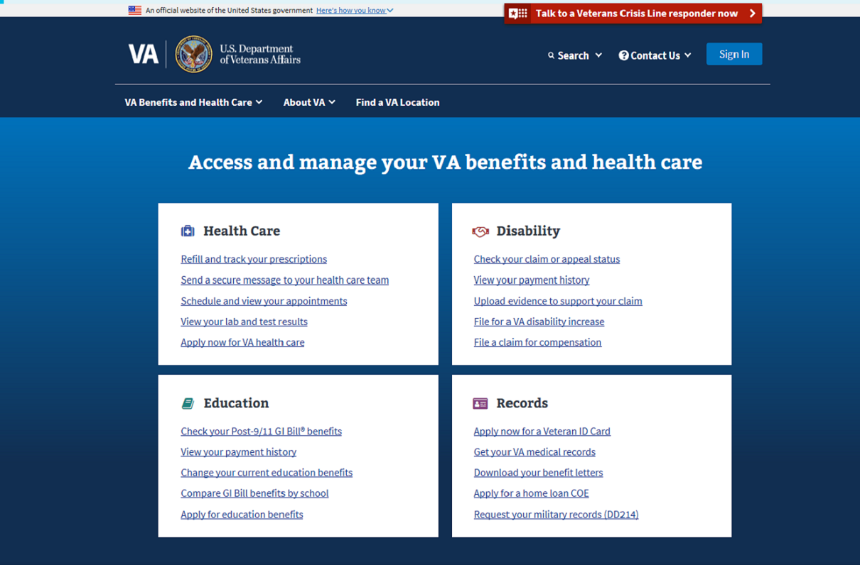
Visitors to VA.gov next month will see a new look for the Department of Veterans Affairs website, one VA officials say will improve beneficiaries' experience and increase the odds that they'll find the answers or contact information they're seeking online.
Here's a bit more about the new setup to get web surfers up to speed before the official launch on Veterans Day.
- Preview of coming attractions. Secretary Robert Wilkie told the Senate Veterans' Affairs Committee last month that the new site would debut on Veterans Day, and that it would be part of his goal “to make accessing VA services seamless, effective, efficient, and emotionally resonant.” Can't wait until Nov. 11? Don't worry: A version of the site is online now at https://preview.va.gov.
- A familiar feel. The change comes exactly three years after the launch of Vets.gov, which went live in 2015 in an effort to “streamline a Veteran's experience to discover, apply for, track, and manage the benefits they have earned in one place using any device,” according to a 2017 report to Congress from the U.S. Digital Service. That site received more than 600,000 applications for health care and education benefits from its launch to the time of the 2017 report, and lessons learned in its construction informed the new VA site.
- Picture perfect. Just how related are the two platforms? Vets.gov and the new VA site both use black-and-white images representing VA beneficiaries in and out of uniform. In some cases, they're identical.
- What changed? Like Vets.gov, the new VA site no longer spotlights feature stories or uses large photos to direct readers toward news on current events or hot-topic issues. As Marty Jacobs, the executive director of VA's digital services team, told FCW for an Oct. 2 piece, “People don't come to government websites to read things. They come to get a task accomplished.”
- What else changed? More links are available on the main page. The current VA site has three categories displayed prominently (health care, benefits, and burials and memorials), but other information is stored in drop-down menus that can be difficult to navigate, especially on mobile devices. The new site has four featured areas (health care, disability, education, and records), followed by a dozen clear headers that take visitors to information on career and employment, pension, home loans, and other benefits.
- Getting personal. The new setup also allows beneficiaries to register for their own online account, which will enable them to create a personal page similar to an online banking portal, Jacobs told FCW. This feature, already available at Vets.gov, will allow the user to log on and receive personalized medical updates, check on claims and appeals, view available balances for education-related benefits, and read up on other individualized details.
- What's next? A new tool designed to improve the process for veterans to apply for increased disability compensation is now in beta mode, meaning it's still undergoing tests prior to an official launch. Beneficiaries can use the beta version to file claims, and provide feedback on the process, here.

